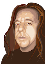
Proportion is paramount to design. 'Scaling' and 'skewing' are as different as looking at yourself in a mirror and looking at yourself in a funhouse mirror. Stretching a picture of your face wide makes you look fat, stretching it tall makes you look skinny.
Same with text. A type designer purposely renders a typeface to be tense or open, flowing or rigid, conservative or novel; a feeling and character emerge that give a font identity, a face. As loathe as I am to distort a picture of your pretty face, so it is with typography.
To idly distort by stretching and pulling the faces of people and text, to lose proportion when imposing a size change, is to break a basic tenet of good design. It also falls short of respect for the sanctity of 'image.'
Constraining proportion is a task that design software does very well when placed in the hands of a competent designer. Holding down the shift key, however easy that may seem, is a act of proportional constraint that many novice designers and students simply fail to do.
Creative license withstanding, disproportionate size changes, unless done in a very deliberate manner by a practiced hand, just look like mistakes.
1 comment:
I find that a picture that has scaling which the artist has taken great pains to adapt design to size makes the overall have a harmony with limited space available. Door or interior moulding,comic book panel,and framing an image fro effect (intensity, passivity,and emotional displacement).
Post a Comment